Finished Best Print
When finishing this print, there was one mistake I made. You are supposed to look at the print horizontally, like the tentacles are going behind the jelly fish. I still think it looks fine though. 1. How does your piece show off the theme of "line"? My piece shows the theme in multiple different ways. The lines on the top of the jellyfish curve, to show shape and dimension. Then I have the tentacles, which are a bunch of different sized lines to show contrast. 2. How is your piece successful and what might you change if you were to do it again? I think my piece actually turned out to be pretty cool. It shows the theme, considering the entire jellyfish is pretty much made up of lines. I also like the colors I chose to use, I think using two colors looks really neat! If I were to do this again, I would pay more attention to detail, and try to contrast the different sizes of lines even more. I would probably also add even more tentacles, maybe curved ones and different shaped ones to make it more realistic.
0 Comments
Most Helpful Warm Up:
In my opinion, the most helpful and interesting warm up was the children's book watercolor. It was super fun to do, especially because we all painted different things. Favorite Part About Watercolor: My favorite part about watercolor is how easy it can be to blend colors. I also really love how it can look messy, but still be really intriguing to look at. Difficulties with Watercolor: If you don't let your paint dry and try to paint over it, the colors blend together and it usually ends up looking like a mess, which can be super frustrating!
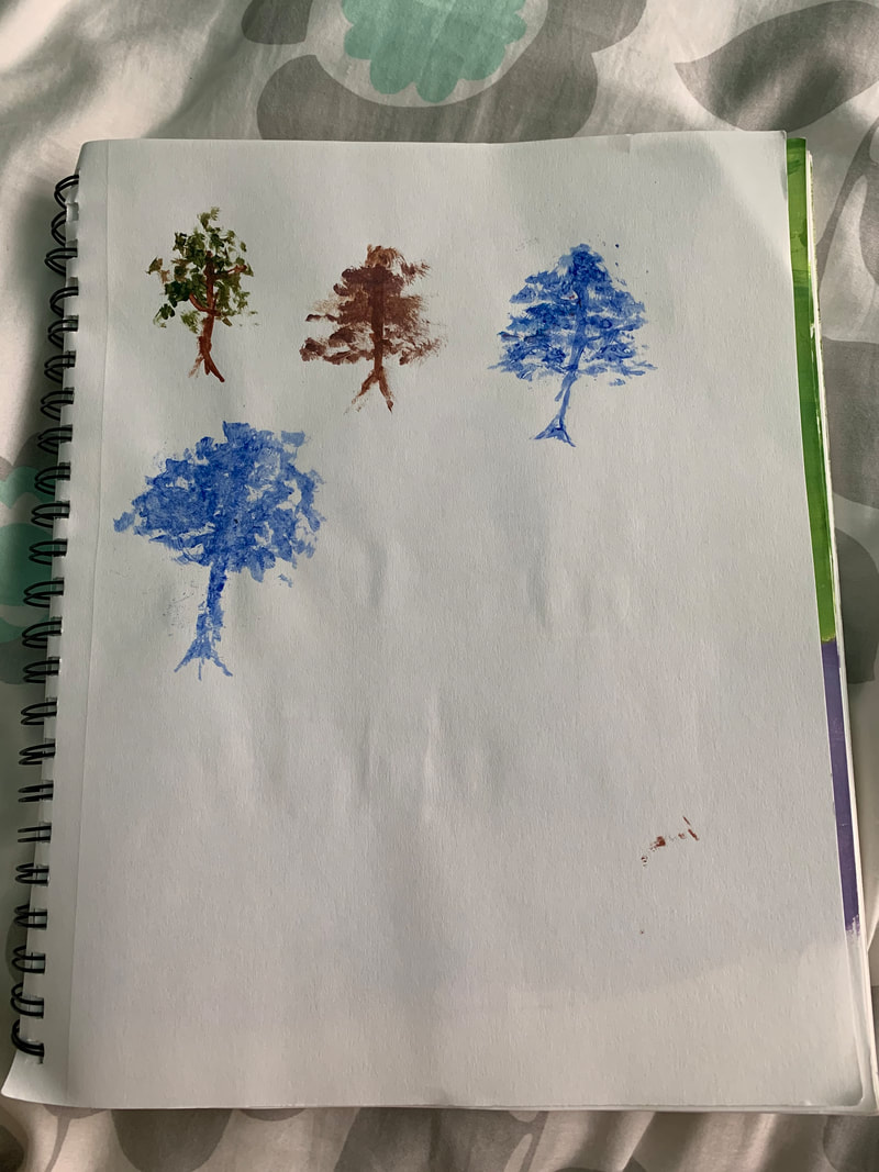
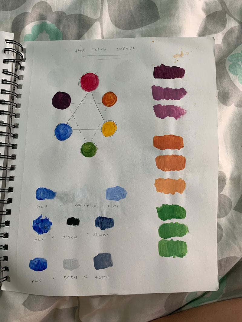
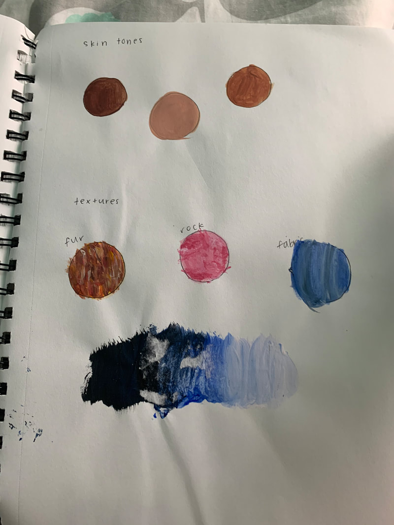
I learned a lot of different things from these activities, like how to match certain colors, and how to make trees not look so fake when painting them! Personally I felt like the gradient one (in the far right photo) was the most helpful for my painting. It did get ruined because the paint wasn't completely dry so the paper stuck to it. But I think it helped me find different ways to blend colors, which I did a lot of while working on my painting! The gradient one also taught me a lot, not just for my idea of place painting, but for other paintings I'll do in the future! I like to paint a lot of sunsets, and usually blending colors is a must. To tone down a color, you have to add black so it gets darker, but not too much depending on how much you want to tone it down!
The place that I chose to paint is the New York City skyline. New York itself isn't super important to me, since I've never lived there, but my aunt and uncle who I am really close to moved there a few years ago. The reference photo I used is from our most recent trip there which was in December of 2018. I think the most challenging part of this painting for me was the sky. At first, I had a difficult time trying to blend the different colors and make it look smooth, but I found certain techniques that helped me a lot! My favorite part and in my opinion, the most successful part of the piece is the sky, since I've always been intrigued by all the different colors sunsets can involve. I first sketched where the skyline and all the buildings would be, then I painted the blue and purple part of the sky and blended them. I then painted the white, and then the yellow and red and blended all of those so the colors didn't look as blocky. After that I waited for the sky to dry so I could begin the skyline and have sharp edges.
 For my Illustration Friday for the word Transparent, I used watercolor. It's a painting of an eye through a window, with tears coming out of the eye. I really value when people are transparent with me, and completely honest and open, so that is why I drew this!
 Pencil Drawing
 Pen Drawing Pros:
 Charcoal Drawing
 Most Helpful Warm-Up Sign Language A Personally, I feel this warm-up was really helpful. Hands have always been something that I am not that great at drawing, and while doing this warm up I felt I was more focused which helped me in drawing it. Obviously, it's nowhere near perfect, but I was able to look more closely into detail at the different shapes and lines my hand has, rather than just drawing the hand and calling it done. Composition
- The way something is put together or made up. Value - The lightness or darkness of tones or colors.  Ewa Juszkiewicz Ewa Juszkiewicz is an artist from Warsaw, Poland who specializes in unusual oil paintings of women including mothers, wives, and daughters. She works with historic paintings, and tends to play around with the woman's face and figure, balancing between what is seen as human and inhuman. Most of the time in her paintings, she removes the actual facial features and replaces them with hair, plants, or ribbons. I think her artwork is really neat, because it allows us to see how she perceives the original historic pieces. The art is also quite unusual, which causes me to be more drawn to it over other pieces. Although the works are strange, I'm still intrigued and curious about how or why she chooses to make them the way they are!  Link to her Website:
www.ewajuszkiewicz.com/ |